How to Use Variable Fonts in HTML/CSS: A Complete Guide

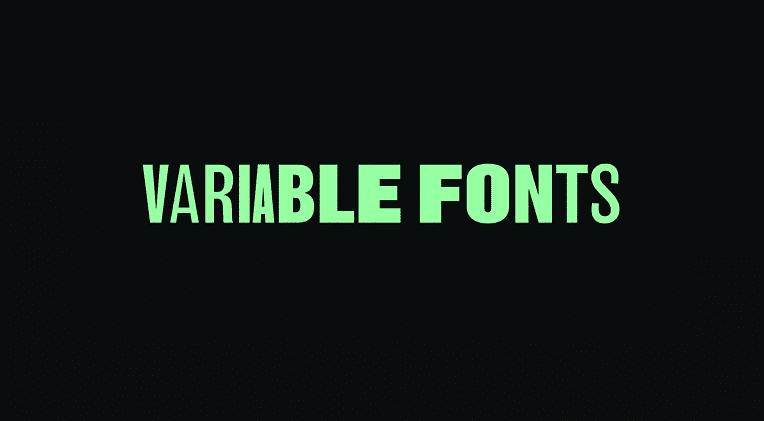
In the evolving world of web design, typography plays a pivotal role in creating compelling and user-friendly interfaces. One of the most transformative developments in this space is variable fonts, a modern font technology that allows a single font file to behave like multiple fonts. Instead of loading several files for different weights and styles (like bold or italic), a variable font includes all styles in a single, flexible file. This not only enhances design versatility but also improves site performance. Let’s explore how to effectively use variable fonts in HTML and CSS to elevate your web projects.
How to Use Variable Fonts in HTML/CSS
Here is how to use variable fonts in HTML/CSS:
Choose a Variable Font
You can download or buy variable fonts from sites like TypeType, or Popular examples include TT Norms® Pro Variable.
Example font-face syntax for a local or web-hosted variable font:
@font-face {
font-family: ‘Roboto Flex’;
src: url(‘RobotoFlex-VariableFont.woff2’) format(‘woff2’);
font-weight: 100 1000;
font-stretch: 75% 125%;
font-style: normal;
}
Note: font-weight: 100 1000; and font-stretch: 75% 125% define the range of supported styles.
Apply the Font in CSS
After declaring the font-face, you can use it like any other font but with more granular control.
body {
font-family: ‘Roboto Flex’, sans-serif;
font-weight: 400;
}
Want to use a custom weight?
h1 {
font-weight: 672; /* Intermediate weight */
}
Variable fonts allow values beyond the usual 400, 700, etc., offering fine-tuned typography.
Animate or Transition Fonts
With variable fonts, you can animate properties like weight or width using CSS transitions.
h1 {
font-variation-settings: ‘wght’ 300;
transition: font-variation-settings 0.3s ease;
}
h1:hover {
font-variation-settings: ‘wght’ 700;
}
This creates a smooth transition from light to bold on hover, without switching font files.
Responsive Typography with Media Queries
Adapt font styles based on screen size using media queries and variable axes:
h1 {
font-variation-settings: ‘wght’ 400;
}
@media (min-width: 768px) {
h1 {
font-variation-settings: ‘wght’ 700;
}
}
This ensures your typography is both stylish and readable on all devices.
Browser Support
Variable fonts are widely supported in all modern browsers including Chrome, Firefox, Edge, and Safari. However, always check compatibility if your audience includes users on older systems.
Best Practices
Here is best practices for using variable fonts:
Understand the Axes
Before implementing variable fonts, get familiar with their available axes—such as weight, width, slant, and optical size. Not all fonts offer every axis, so review the font’s specification or documentation to understand its capabilities. Using axes thoughtfully allows you to fine-tune typography for different screens, devices, or design intentions.
Use Fallbacks for Compatibility
Although modern browsers support variable fonts, not all older ones do. Always provide fallbacks by including a static font version in your CSS stack. This ensures users with outdated browsers still see your content in a readable and visually consistent way, reducing the risk of display issues.
Conclusion
Variable fonts mark a major leap forward in web typography. They offer a beautiful blend of performance, creativity, and control—all from a single font file. By understanding how to use them with HTML and CSS, you open up new possibilities for responsive, elegant, and efficient web design. Whether you’re building minimalist portfolios or complex editorial sites, variable fonts will empower your type to adapt and shine across screens.


